Picking Duck

Story: Ever watch a sports game with your friends and you have one friend confidently babbling on about how so-and-so is going to dominate or how such-and-such is going to happen? Or are you that friend? Regardless, sports is all competition, hence, the nature of sports betting, fantasy sports, and so forth. But the barrier of entry to sports betting is often too high and intimidating for most to feel comfortable participating. people see a bunch of numbers scattered throughout with plus and negative sides and betting jargon like, "over and under" or "money line" and all interest drops, especially if real money is involved. And that's where picking duck comes into play, to make that barrier much lower than it has to be and introduce the riveting and risqué fun of sports betting for all to enjoy. but how have they attempted to lower the intimidation factor? They have done so by creating an online platform for sports-enthusiasts and gambling-enthusiasts alike to make picks on any number of sports games without any real cost, utilizing virtual currency called chips. With their website, people can put their 'chips' where their mouths are and prove to others their sports knowledge. And eventually, when they have built up their status enough, they can even hide their picks to sell to others or use the website as a guide to participate in real world sports betting. simple as that!
Problem: In an attempt to lower the barrier of entry for those unfamiliar with the sports betting world, some additional details needed to be altered to create for a much more intuitive experience. In addition, the social aspect between users was minimal, thus limiting the sense of community amongst players (ducks).
Role: user research, user interviews, persona/scenario creation, ui design
Team: jae lee & steven lowe
Time Frame: 2 weeks
Tools Used: paper, pencil, white-board, markers, index cards, sketch, google drive, invision, and usertesting.com.
Process:


• conducted user-research out in the field with individuals ranging from those simply familiar with sports/sports-betting to those who are major enthusiasts of this realm and found that certain terminology such as "ducks" and "money line" were confusing. we addressed those by changing the meaning of "ducks" to "users" and with betting jargon like "money line," we created an on-boarding process for users to read through the first time they register through the website. and for those that would need a refresher at any point, we kept the "how to play" section live as a reference. but most importantly, we re-structured and edited some of the content on these instructional pages to prevent overlap or repetition.

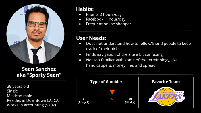
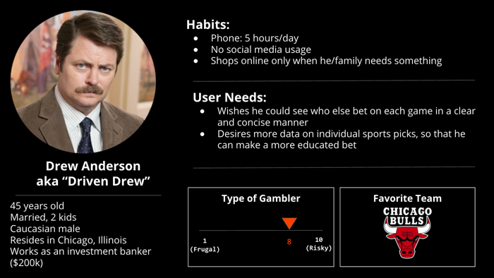
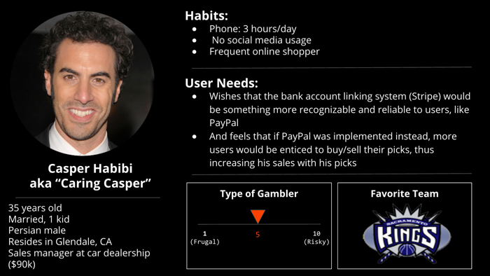
• conducted additional research we had about those who watch sports/bet on sports, we proceeded onward with three user personas that closely matched the three types of users that would most likely frequent picking duck (as seen in the images to the left: sporty sean, driven drew, and caring casper).

• worked with the client, the picking duck team, and stayed in constant communication about requirements and branding, as well as learning about their business and what they wanted to achieve. personally, i did not understand the world of sports betting and they referred me to shows and other learning resources that would give me a good enough education so i could really get into the mindset of our users.
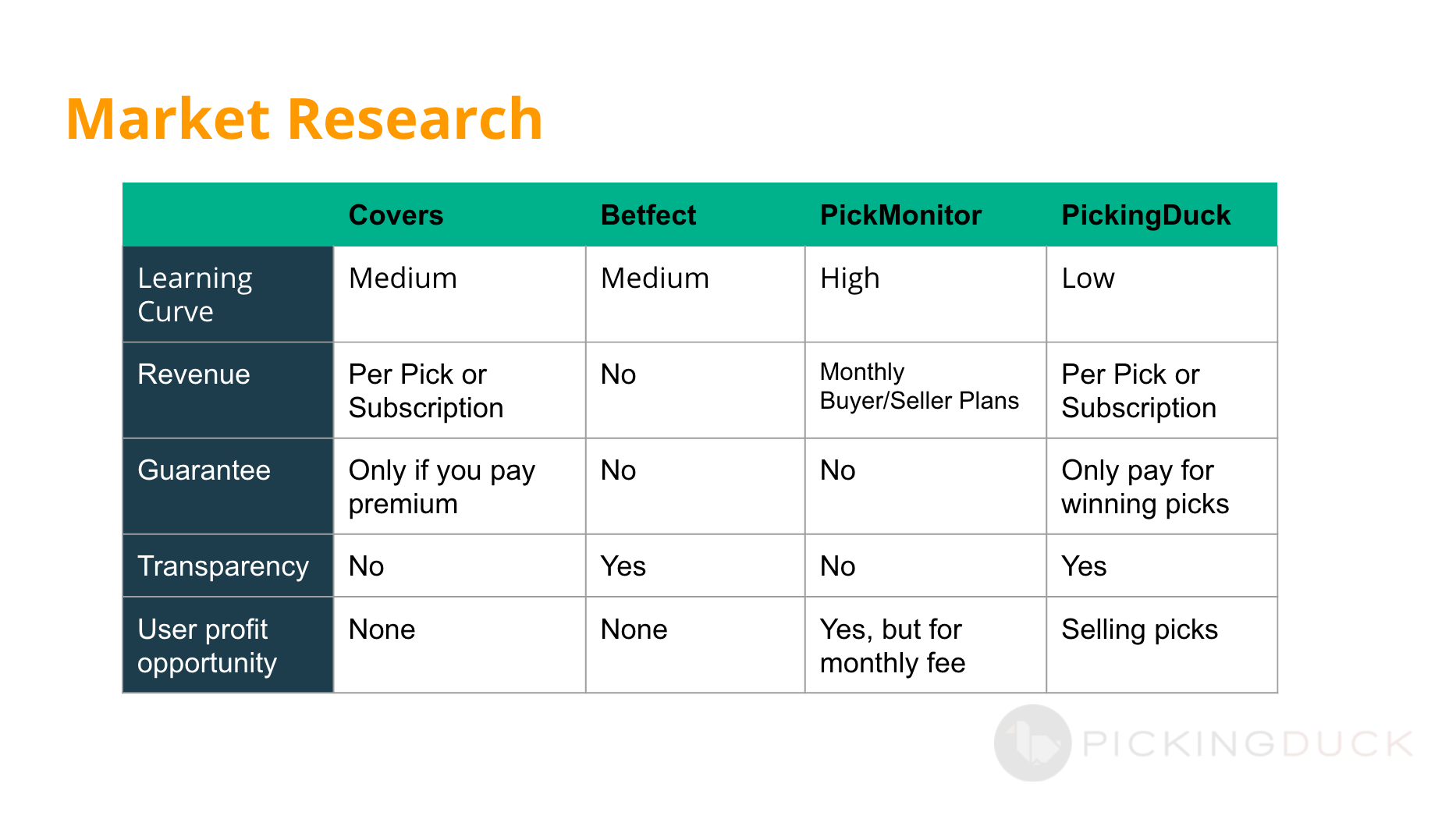
• did more research on the market of sports-betting, looking at websites like "Pickmonitor" and "betfect," as they were both most closely related to what picking duck was doing and to see what they were doing well versus poorly to better enhance picking duck's user experience
• with the brush-up education of the world of sports-betting as well as the user research and the market research, we designed lo-fi wireframes, which then we met with the picking duck team for feedback and further scope-refinement.
• next, with feedback from the picking duck team, we tackled some design issues regarding our users' flows and then started work on the user interface. with the ui, we realized that the orange colors on their website were used for both links and sub-headers of certain pages, causing some confusion for our users the interviews as well. we addressed this issue by going through every page to make sure the font sizes and colors were all uniform and aligned to their appropriate functions.
• then, we wanted to add more to the gamification element of the website, as the picking duck team had expressed to us that part of their future goals included a gamification aspect with contests. we wanted to jumpstart that introduction by implementing status symbols for users (pictured to the left) with "duckling" for novice, "mightly mallard" for top duck, and "hot mighty duck" for hot duck.

• afterwards, we decided this would be the best time to utilize usertesting.com to see how our new design ideas would fare in the field, so we conducted user-testing and got enough feedback to reiterate on our designs before showing the picking duck team.


• and lastly, but definitely not least, we worked on making the website more responsive. the designs they had prior to our work together were not mobile-responsive. and considering that more than half of their users accessed the website through mobile devices (their google analytics), we knew we had to do a total re-design. so, with approval from the picking duck team, we took on the challenge and started editing down content with information architecture to make sure it was concise and straightforward without losing functionality.


Solution: All in all, as a team, we revamped the website to create for a much more welcoming and novice-friendly environment by addressing the following details: branding, on-boarding, user interface design, gamification and mobile-responsiveness.

